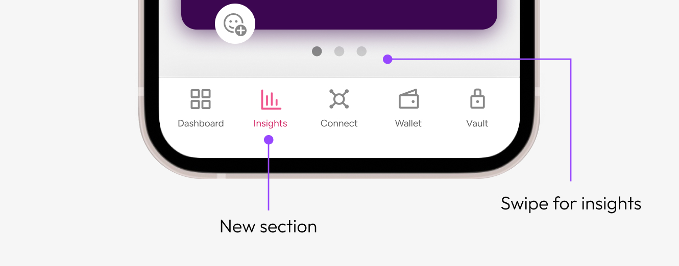
A personalized insights feature that turned user data into a shareable narrative—boosting engagement and helping users understand the value of connecting their data accounts.
Caden is a data platform where users can connect accounts like Uber, Amazon, and Spotify in exchange for insights and rewards. However, users didn’t understand what they were getting in return. Our challenge: create an experience that made the product’s value instantly clear, emotionally resonant, and worth sharing.
Design a shareable, delight-inducing feature that visualizes a user's connected data in a meaningful, human way.
The possibilities of insights was endless, so these are some things we kept in mind for version one.

Ideally users will see new insights on a regular basis, so it was essential to establish something scalable for engineering and data teams.

How we could make them interesting and relevant enough for users?

How can users these insights be share across channels?
This first version is a foundation for shaping future iterations.
I held a brainstorm with product, marketing, and data teams for possible insight ideas with the current data set for each connection.

I then defined the impact and effort of each idea. We aimed to have one insight per category that would fit in to the scope of this porject.

In order to keep scope to a minimum, templates were established for data to be plugged into based on the users' conditions. See examples of the wireframe templates below.

We wanted another way to measure engagement other than connections made, so we creating some simple "games" for the user to interact with.


We felt this feature didn't neatly fit within the current architecture, so we decided to create a page. Users can swipe through cards to see insights.

This is an example of how the template works. Any text or image can be pulled in here to make the insights personalized.
If the user does not have that data source connected, they will see a general insight along with a CTA to add it.

We wanted to know what insights users liked, so we added the ability to react. This feature was only used by 4% of users so we will omit for the next version.

Tabs at the top of the page are where the user can switch between personal and global insights. The cards show logos of which data is being used to produce the insight.

Users were extremely motivated to connect more with post insight launch. We broke a record for most number of connections made in one day about a week post launch! We are still monitoring this.

We saw a great increase of data from these five accounts. The impact on location connections surprised us, but we are aware all users have an avalible location to share unlike other accounts.

This was a productive and rewarding learning experience for the team. Users respond to insights so, it will become a permenant feature in the app soon!