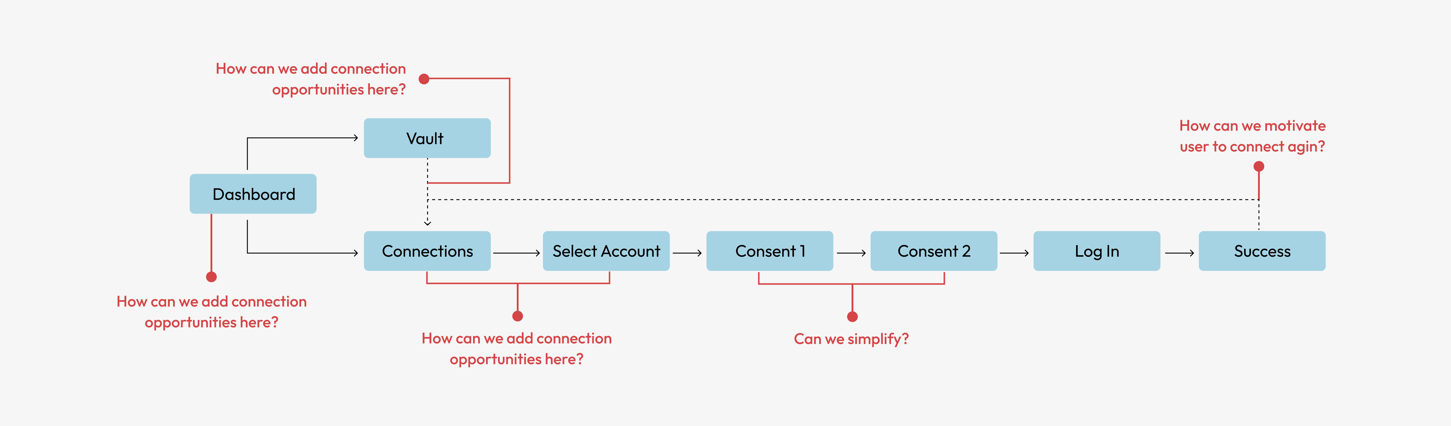
The Connections" section allows users to link accounts such as Netflix, Amazon, or credit cards to their Caden account. It also displays the status of connected accounts and shows potential earnings from each connection.
The page was text-heavy and lacked visual dynamism. The ledger design was disorganized and not scalable as more connection options were added. Additionally, there was no way to run campaigns to promote bonuses or personalize CTAs for users.
The existing designs had way too much text and other distracting elements. The hierarchy of information wasn't clearly representing what we wanted and overall the designs were static and lacked personalization.
I held a brainstorm session with design, engineering, marketing and product.
We thought of possible solutions and grouped them as following.
Being mindful of scope, we then assessed each idea on the impact it may have and effort required and agreed on what we should focus on.
I laid out the user journey and thought about how we can make it work better for us without making any drastic changes.
We built the capabilities to personalize this card based on the user's status and marketing campaigns. This is the first element the user will see which will better guide them on what to do next.
We needed a more scalable ledger as the app grew. We also needed it to be flexible enough to advertise certain bonuses and clearly show the status of connections and what needs their attention.
This was a new component developed that would allow the user to make connections anywhere within the app. It contains a simplified version of the ledger above to give the user just enough informaiton to make a decion on without having to navigate to the connections page.
We created personalized cards to show at the end of a successful connection to motivate the user to keep connecting more accounts and capitalize on the event.
We saw an increase data sources connected post launch. It was incredible exciting to see how users responded to specific targeting and campaigns, which we can tailor to B2B needs.
Users were more likely to engage when an action was needed to keep their connection in a healthy state. We implemented a few ways to show actions were needed and reiterated that they will not be earning points until an action is made.
This update was a huge collaboration with many different teams and it was rewarding across the board. One main takeaway was that users don't need as much information as we think. We found just the right balance to educate the user without overwhelming them.
We had so many ideas on how to improve this page, it was a good chance to go back to architecture of the app and define the goals of each section. This helped us narrow down what to focus on on this page and what to save for other updates.